

Introduction
Have you ever worked on a project, and after further review, your styling seems misaligned or inconsistent in some way? Or are you looking for styling guidelines for your next solo project? - That's where design systems come to the rescue.
This article breaks down design systems, The benefits they provide, and how to build them out in front-end applications from the perspective of a front-end engineer. While there are no stringent prerequisites to follow along, a good understanding of Reactjs and Typescript is required
What are Design Systems?
In 2013, Brad Frost introduced the concept of Atomic Design. In its essence, Atomic design is a methodology that breaks down UI components into smaller, reusable building blocks categorized as atoms, molecules, organisms, templates, and pages. Just like a Lego brick, the smaller pieces fuse to form bigger pieces, which also fuse to form more complex pieces.
Design systems are a set of standard, reusable components, and patterns that are used to create visual consistency throughout your project. From the perspective of a front-end engineer, it teaches you how to structure applications into reusable components and avoid repetition.
What are Atoms?
Atoms are the foundational building blocks of a design system. In front-end development, atoms typically correspond to basic HTML elements like buttons, input fields, checkboxes, and icons.
They represent the smallest, indivisible components that cannot be broken down further without losing meaning.
What are Molecules?
Molecules comprise a group of atoms working together to form a more complex unit. It can be a combination of atoms, such as a search bar (consisting of an input field atom and a button atom, a form (combining input fields, buttons, and labels), or a card component (containing text, images, and buttons).
What are Organisms?
Organisms are higher-level components that combine various atoms or molecules to form a distinct section of a user interface. An example of organisms is a Header that is composed of a Logo, navigation menu, and search bar, Or a product listing that comprises of product card and filtering/sorting control, Or a form section.
Putting Design System Into Practice
To effectively translate a design system to code, consider the following principles and practices:
1. Define Design Tokens:
Design tokens are foundational values that are used to maintain visual consistency across components. These foundation values include colors, typography styles, spacing units, and breakpoints.
/* Primary Colors */
:root {
  --primary: #007bff;
  --primary-50: #cce0ff;
  --primary-100: #99ccff;
  --primary-200: #66b3ff;
  --primary-300: #3399ff;
  --primary-400: #007bff;
  --primary-500: #005cbf;
  --primary-600: #004499;
  --primary-700: #003374;
  --primary-800: #00264d;
  --primary-900: #001a33;
}

/* Secondary Colors */
:root {
  --secondary: #ff9900;
  --secondary-50: #fff2e6;
  --secondary-100: #ffddb3;
  --secondary-200: #ffc680;
  --secondary-300: #ffb34d;
  --secondary-400: #ffa326;
  --secondary-500: #ff9900;
  --secondary-600: #e68a00;
  --secondary-700: #cc7a00;
  --secondary-800: #b36b00;
  --secondary-900: #995c00;
}

/* Additional Colors */
:root {
  /* Danger Colors */
  --danger: #dc3545;
  --danger-50: #fee2e4;
  --danger-100: #fcc6cc;
  --danger-200: #faaeb4;
  --danger-300: #f9969c;
  --danger-400: #f77e84;
  --danger-500: #f55d6e;
  --danger-600: #f34d5f;
  --danger-700: #f03d50;
  --danger-800: #ee2d41;
  --danger-900: #ec1d32;

  /* Info Colors */
  --info: #17a2b8;
  --info-50: #d8eef2;
  --info-100: #b2ddee;
  --info-200: #8dd1e9;
  --info-300: #67c5e5;
  --info-400: #41b9e1;
  --info-500: #17a2b8;
  --info-600: #138496;
  --info-700: #106273;
  --info-800: #0d4851;
  --info-900: #0a2c30;

  /* Warning Colors */
  --warning: #ffc107;
  --warning-50: #fff8e0;
  --warning-100: #ffecb3;
  --warning-200: #ffe380;
  --warning-300: #ffd24d;
  --warning-400: #ffca26;
  --warning-500: #ffc107;
  --warning-600: #e6ae00;
  --warning-700: #bf9500;
  --warning-800: #997d00;
  --warning-900: #806800;

  /* Success Colors */
  --success: #28a745;
  --success-50: #d4edda;
  --success-100: #a9e2c8;
  --success-200: #7dceb5;
  --success-300: #51baa3;
  --success-400: #37b386;
  --success-500: #28a745;
  --success-600: #218838;
  --success-700: #1e7232;
  --success-800: #1a602b;
  --success-900: #154c22;

  /* White & Black Colors */
  --white: #fff;
  --black: #000;

}

:root {
  /* Font Family */
  --font-family: 'Arial', sans-serif;

  /* Font Sizes */
  --font-size-small: 14px;
  --font-size-base: 16px;
  --font-size-medium: 18px;
  --font-size-large: 24px;
  --font-size-extra-large: 32px;

  /* Font Weights */
  --font-weight-normal: 400;
  --font-weight-bold: 700;

  /* Line Heights */
  --line-height-base: 1.5;
  --line-height-small: 1.3;
  --line-height-large: 1.8;

  /* button size */
   --button-small: 8px;
  --button-medium: 16px;
  --button-large: 24px;

  /* padding size */
   --padding-small: 8px;
  --padding-medium: 16px;
  --padding-large: 24px;

}
2. Establish Component Structure:
Design components should have a consistent structure and naming convention and each component should contain its functionality and presentation (styling), accept props, and emit events as needed.
src/
|-- components/
|   |-- atoms/
|   |   |-- Button/
|   |   |   |-- Button.tsx
|   |   |   |-- Button.css
|   |-- molecules/
|   |   |-- SearchBar/
|   |   |   |-- SearchBar.tsx
|   |   |   |-- SearchBar.css
|   |-- organisms/
|   |   |-- Header/
|   |   |   |-- Header.tsx
|   |   |   |-- Header.css
|   |-- templates/
|   |   |-- MainTemplate/
|   |   |   |-- MainTemplate.tsx
|   |   |   |-- MainTemplate.css
|   |-- pages/
|   |   |-- HomePage/
|   |   |   |-- HomePage.tsx
|   |   |   |-- HomePage.css
The directory structure above represents a project organized according to atomic design principles. Consistency is achieved through the categorization and hierarchy of components within distinct folders.
3. Implement Atomic Design Principles
- Button Atom
/* Button.tsx */
import React, { FC, ComponentProps } from 'react';
import './Button.css';

type ButtonProps = ComponentProps<'button'> & {
  className?:
    | 'primary'
    | 'secondary'
    | 'danger'
    | 'info'
    | 'warning'
    | 'success'
    | string;
  size?: 'small' | 'medium' | 'large' | 'medium';
  children: React.ReactNode;
};

const Button: FC<ButtonProps> = ({
  size = 'medium',
  children,
  className,
  ...rest
}) => {
  return (
    <button className={`button ${className} ${size}`} {...rest}>
      {children}
    </button>
  );
};

export default Button;
Explanation:
In the button component above,
The
Buttoncomponent accepts several props includingtype,size,onClick, andchildrensizedetermines the font size of the button text,classNamedetermines the background color and text color of the button.childrenis a required prop that represents the content inside the button, which can be text, icons, or other React nodes....restsyntax collects all the remaining props not explicitly defined into a variable namedrest.
<button> element's JSX, the rest variable is an object containing all these remaining props and the spread operator ({...rest}) is used to spread all the collected props onto the <button> elementFor the button styling,
/* Button.css */
.button {
  padding: var(--button-medium) var(--button-large);
  font-size: var(--button-medium);
  border: none;
  border-radius: 4px;
  cursor: pointer;
  outline: none;
  transition: opacity 0.2s ease-in-out;
}

/* Primary Button Styles */
.primary {
  background-color: var(--primary);
  color: var(--white);
}

/* Secondary Button Styles */
.secondary {
  background-color: var(--secondary);
  color: var(--white);
}

/* Danger Button Styles */
.danger {
  background-color: var(--danger);
  color: var(--white);
}

/* Info Button Styles */
.info {
  background-color: var(--info);
  color: var(--white);
}

/* Warning Button Styles */
.warning {
  background-color: var(--warning);
  color: var(--white);
}

/* Success Button Styles */
.success {
  background-color: var(--success);
  color: var(--white);
}

/* Size Variants */
.small {
  padding: var(--button-small) var(--button-medium);
  font-size: var(--button-small);
}

.medium {
  /* Default styles applied */
}

.large {
  padding: var(--button-medium) var(--button-large);
  font-size: var(--button-large);
}

/* Hover State */
.button:hover {
  opacity: 0.8;
}
/*Disabled state*/
.button:disabled{
  cursor: not-allowed;
}
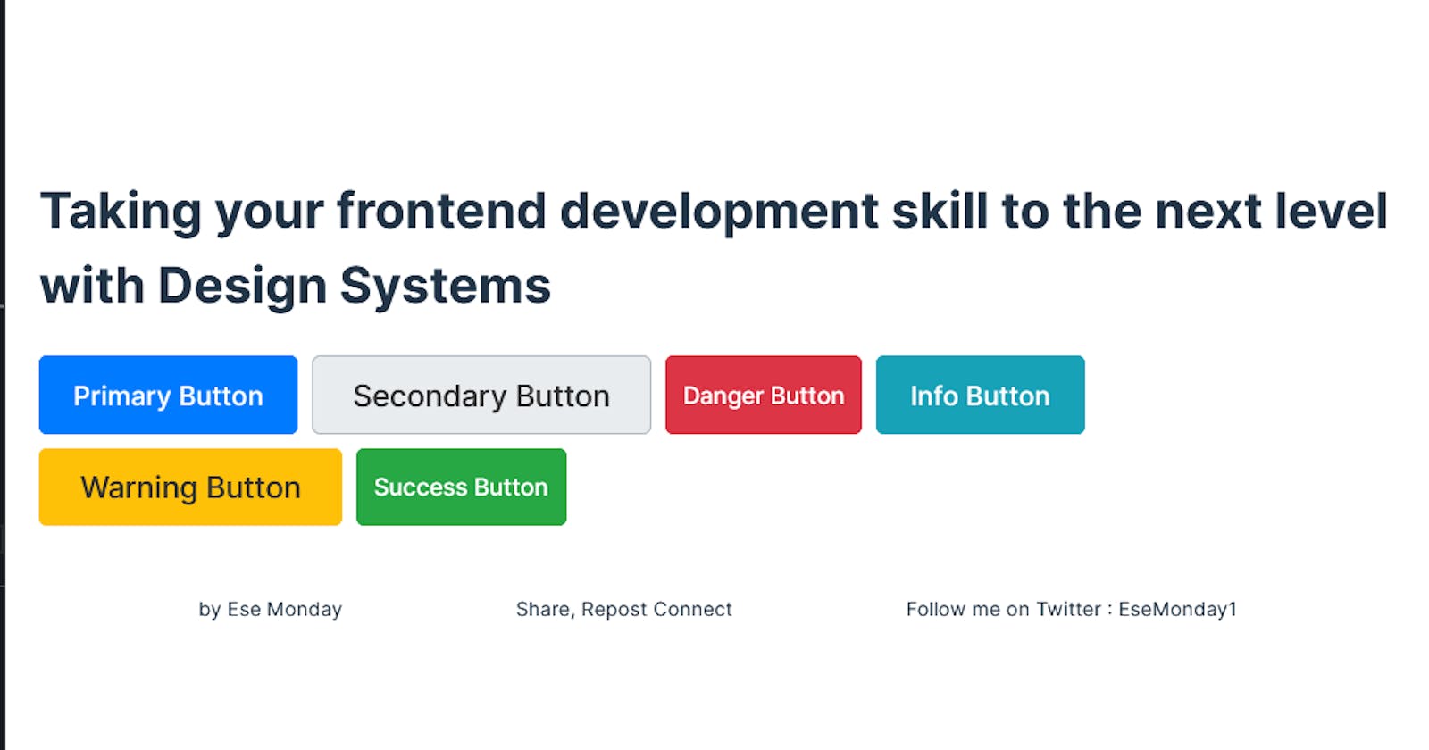
From this point onward, creating a button of any type or size is as simple as importing the Button component and specifying the desired type and size and any additional props allowed on HTML buttons.
import Button from '/path to Button component'
const handleClick = () => {
console.log(click)
}

const App = () => {
return (
    <main>
        {/* A large sized primary button */}
        <Button type="primary" size="large" onClick={handleButtonClick} >
            Primary Button
     </Button>

      {/* A medium sized secondary button */}
        <Button
         className="secondary"
           size="large"
         disabled={true} //Disable the button
         onClick={handleButtonClick}
         aria-label="Secondary Button" // Attributes for accessibility
          >

    {/* A small sized danger button */}
    <Button type="danger" size="small" onClick={handleButtonClick}>
            Danger Button
     </Button>

     {/* A medium sized info button */}
     <Button type="info" size="medium" onClick={handleButtonClick}>
            Info Button
      </Button>

      {/* A large sized warning button */}
      <Button type="warning" size="large" onClick={handleButtonClick}>
            Warning Button
      </Button>

      {/* A small sized success button */}
      <Button type="success" size="small" onClick={handleButtonClick}>
            Success Button
       </Button>

    </main>
b. Input Atom
/*Input.tsx*/
import React, { ChangeEvent, ComponentProps } from 'react';
import './Input.css';

type InputProps = Omit<ComponentProps<'input'>, 'onChange'> & {
  type?: 'text' | 'password' | 'email';
  className?: 'small' | 'medium' | 'large';
  value: string;
  onChange: (value: string) => void;
  placeholder?: string;
  isValid?: boolean;
  label?: string;
};

const Input: React.FC<InputProps> = ({
  type = 'text',
  className = 'medium',
  value,
  onChange,
  placeholder,
  isValid = true,
  label,
  ...rest
}) => {
  let classNames = `input ${className}`;
  if (!isValid) {
    classNames += ' error';
  } else {
    classNames += ' valid';
  }

  const handleChange = (e: ChangeEvent<HTMLInputElement>) => {
    onChange(e.target.value);
  };

  return (
    <div className="input-container">
      {label && <label className="input-label">{label}</label>}
      <input
        type={type}
        className={classNames}
        value={value}
        onChange={handleChange}
        placeholder={placeholder}
        {...rest}
      />
    </div>
  );
};

export default Input;
Explanation:
In the Input component above,
The
Inputcomponent accepts several props includingtype,size,value,onChange, andplaceholder.The
onChangeis an event and it specifies the function to call when the input value changes, invoking theonChangeprop function with the updated value.The
classNameprop determines the padding and font size of the input based on the specified size (small,medium,large).The input element (
<input>) is wrapped inside adivwith the classinput-container, allowing for additional styling and structure.The
...restsyntax collects all the remaining props not explicitly defined in the atom into a variable namedrest.
For the Input styling,
/* Input.css */

.input {
  padding: var(--padding-medium);
  font-size: var(--font-size-base);
  border: 1px solid #ccc;
  border-radius: 4px;
  width: 100%;
  box-sizing: border-box;
  transition: border-color 0.2s ease-in-out;
}
.input-container {
  margin-bottom: 10px;
}
.input-label {
  font-size: var(--font-size-small);
  font-weight: var(--font-weight-bold);
  margin-bottom: 8px;
  display: block;
  color: var(--black);
}
.input.small {
  padding: var(--padding-small);
}

.input.large {
  padding: var(--padding-large);
}

.input:focus {
  outline: none;
  border-color: var(--primary);
  box-shadow: 0 0 5px var(--primary);
}

.input:hover {
  border-color: var(--primary);
}

.input.error {
  border-color: var(--danger);
  box-shadow: 0 0 5px var(--danger);
}

.input.valid {
  border-color: var(--success);
  box-shadow: 0 0 5px var(--success);
}
4. Separation of Concerns
Separate concerns between structure (HTML), styles (CSS), and behavior (JavaScript/TypeScript):
Place markup and structure in
.tsxfiles.Define styles in separate
.cssor.scssfiles.Use CSS Modules, Styled Components, or other styling solutions to keep styles within components.
You can find the completed code on Stackblitz.
The Benefits of a Design System Approach
By adopting a design system approach:
Consistency: You ensure a cohesive user experience by having a single source of truth for your UI components.
Efficiency: You reduce development time by leveraging components that have been pre-built, tested, and documented.
Scalability: You can now easily create new variations of components as your project evolves, without complications to your code base.
Collaboration: You improve communication and alignment between designers and developers by speaking a common visual language.
Conclusion
As a front-end developer, embracing a design system approach can significantly transform your development process and the quality of your final product while also improving your code structure.
Here are three popular open-source design system kits to elevate your front-end applications:
1. Material-UI
Website: Material-UI
GitHub Repository: Material-UI GitHub
Description: Material-UI is a popular React UI framework that implements Google's Material Design principles. It provides a comprehensive set of ready-to-use components such as buttons, inputs, cards, and more.
2. Ant Design
Website: Ant Design
GitHub Repository: Ant Design GitHub
Description: Ant Design is a design system and React UI library developed by Ant Financial. It offers a wide range of high-quality components and design patterns, following the principles of Ant Design's comprehensive design language.
3. Bootstrap
Website: Bootstrap
GitHub Repository: Bootstrap GitHub
Description: Bootstrap is one of the most popular CSS frameworks for building responsive and mobile-first web projects. It provides a collection of pre-styled components (e.g. buttons, forms, navbars) and utilities (e.g., grid system, typography) that streamline front-end development.